
- 4:17 PM - 1 comments
Longhorn Percept 2.0
Just a quick shot of the .psd for Percept 2.0.
This theme, an update of one I released previously, is based on the wonderful aveapps skins developed by stefanka, which in turn were based on the concept work of Microsoft's Longhorn OS, particularly that done by a variety of Mac artists to use as blog and app skins.
It's interesting that, even when the inspiration is an MS concept, somehow Mac designers manage to get it right where MS's designers fail. Whilst this particular skin maybe too wasteful and needlessly extravagant for some, the soft gradient on the glass, the subtly complimentary colours and the simplicity of the design show the direction MS should have taken with aero. Instead, whilst the PDC themes of old managed to capture some of this elegance, the Vista release features harsh glosses, clashing tones that fail to serve even a marketing purpose, and a confusion in the overall design that belies the time it has been in development.
Glass could have given an ephemeral aspect to open windows that lightened a user's desktop and focused attention on content, whilst offering a smooth, unbotrusive and modern feel. Instead it does the opposite by being overy heavy, overly defined and every bit as 'in your face' as Luna ever was. I'm a Windows fan at heart, amd I fundamentally believe that it offers a better platform for the majority of users, but I really wish the design department would stand by their convictions and force the acceptance of the notion that Windows users actually want revolution, not just evolution.
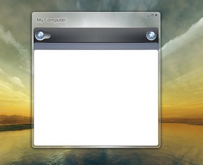


HI!
Your themes are very impressive, where can i dowload theme?