- 7:36 AM - 2 comments
Microsoft UI Photos: Vienna's Visual Direction?
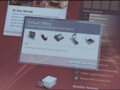
That great repository of information and home of many talented designers and programmers, AeroXperience ( http://www.aeroxp.org/board/ ), recently hosted some photos taken from a tablet PC UI demo. Thanks to Stephen for always getting great exclusive images by some mysterious means. What struck me was how simple and professional these images looked, and the manner in which they took the base elements from Vista, but presented them in a very non-Microsoft understated way. Really, I was left genuinely impressed, but also asking why, if these concepts had been on the board for at least a year, more of these visual cues didn't appear in Vista itself. One can only hope that the direction Vienna is taking has more in common with this style than it does with the glossy, brash and, in many places, clashing interface of Vista.
MS needs to have more faith in its UI teams and also in its userbase. Everyone is ready for a change.


MS needs to have more faith in its UI teams and also in its userbase. Everyone is ready for a change.


I'm not sure if this represents any UI direction for Vienna, but it sure is beautiful.
Keep up the good work.